
I wish I knew.
Robert Crawford asked “Why are there so few interactive visualization software application products in the legal space? Attenex Patterns showed us the power of visual analytics to dramatically improve productivity in the legal market. Yet, outside of Patterns and maybe Ravel’s legal applications there aren’t any other examples. Why?”
Robert, I wish I knew.
What is Visual Analytics?
Sean McNee in his paper “A Primer on Visual Analytics” defines the discipline as:
“The discipline of visual analytics was formed to support analytic reasoning through the use of information visualizations as a form of external cognition [Thomas 2005]. For example, a research scientist could visualize citations across scientific publications to spot research trends. As such, visual analytics is related to several other disciplines, including information visualization, content analytics, and visual search. Before reviewing these connections, we first will formally define visual analytics.
Definition of Visual Analytics
“The formal definition of visual analytics is the use of interactive information representations to shape and control an analytic reasoning process.
“There are four parts to this definition:
1. Interactive information representations
2. The analytic reasoning process
3. Shaping the information flow in an analytic reasoning process
4. Controlling the analytic reasoning process
“We will discuss each of these in turn.”
McNee summarizes visual analytics in this diagram.
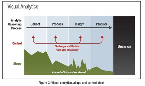
Visual Analytics Illustrated
Thoughts on Why There are so few Visual Analytics Software Products
My current beliefs for why there are so few application products that use visual analytics for unstructured information are the following:
-
- Interactive visual analytic tools are not intuitive. They require training.
- Keyword search is intuitive and ubiquitous. Visual searching is not.
- Data visualizations are relatively intuitive and ubiquitous. Unstructured information visualizations are not.
- Visual analytics applications work best with users who are going to be working with the tool all day long like document reviewers in eDiscovery.
- The axes of the visual search results are difficult to generate in ways that make sense to the user.
- Visual analytic tools must be fast from start time to seeing results.
- Keyword results from Boolean search engines are displayed in much less than a second.
- The user never sees the behind the scenes work to index and analyze the content to make the searching appear very fast.
- Visual search is often slow to respond due to either the local computing required or the transit time for network requests to the cloud.
- Keyword results from Boolean search engines are displayed in much less than a second.
- Most people educated in Western society are not trained visually. Most Western education focuses on words.
- Of the five senses, only three are primarily used to convey information – visual, auditory, and kinesthetic (VAK). Estimates are that the population is evenly divided into each category as their primary learning style. Thus, only 1/3 of users on average are able to think and communicate naturally in a visual style.
- Some professions attract people who are dominant in one of the learning styles.
- The legal industry overwhelmingly attracts people who are good with words (the auditory learning style – spoken and written words).
- The design profession primarily attracts people who are visual.
- Sporting professions and the arts attract people who are kinesthetic.
- Most software developers want to start with 3D or 4D (3D representations animated through time) visualizations. Users have little idea how to navigate three dimensional space and constantly get lost. 3D visualizations do not work for visualizing unstructured information. However, they look really cool.
- A very tiny percentage of humans understand 3D projections onto 2D computer monitors.
- Adam Pidlisecky and Rowan Cockett at 3Point Science confirmed the challenges for scientists and oil exploration professionals to understand 3D projections of geophysical data.
- There are no first principles or prescriptive frameworks for designing visual analytics applications.
- Tufte has done an excellent job of showing 100s examples of descriptive information design. However, he has produced very little in prescriptive design principles.
- Producing a visual analytics application is an iterative time consuming process of coming up with ideas, developing a prototype, having a metric, and testing the prototype to see if it improves the metric. For the first four years of Attenex Patterns development, we iterated through more than 350 prototypes. Only 1 in 5 prototypes increased our metric of “document decisions per hour.” The rest of the prototypes were discarded.
- A successful visual analytics product must understand its context of use, particularly what kinds of decisions the application must support.
- A successful visual analytics product should strive for the Holy Grail of information visualization as described by Ramana Rao – “using visualization as a filtering tool, not just visualizing already filtered information.”
- Potential customers (influencers, purchasers and users) make up stories and mock what they don’t understand.
- We captured many of these “first impressions” as name the dots.
- Interactive visual analytic tools are not intuitive. They require training.

Attenex Patterns Iterative Prototyping in multiple dimensions – see Attenex Briefing Book

Can you name what you see?

Holy Grail of Information Visualization

Contexts of Visual Analytics – See Working with Interactions in Context
Over forty years of developing software products, I participated in the explosion of digital information. I was frustrated that the only tools I had for searching were keyword in nature like the ubiquitous Google interface. The dirty little secret of keyword searching is that you have to know the answer before you start. Then, the results displayed as cryptic lists of lists were agony to scan through to find something close to what I am looking for. I believed there was a better way. At Attenex, we found a customer problem, eDiscovery for litigation, that would fund the development of some form of visual search tool.
As mentioned in “Attenex Patterns History – The Critical First Year,” we were inspired by the work of Jim Thomas and the visual analytics researchers at PNNL. They showed us that the principles for “why visualization” espoused by Ilinsky and Steele in Designing Data Visualizations also applied to visualizing unstructured information and network graph structures like social networks:
“Before we dive into the categories, however, it may be useful to pause for a moment and be explicit about why visualization is a useful medium for examining, understanding, and transmitting information.
-
-
- Visualization leverages the incredible capabilities and bandwidth of the visual system to move a huge amount of information into the brain very quickly.
- Visualization takes advantage of our brains’ built-in “software” to identify patterns and communicate relationships and meaning.
- Visualization can inspire new questions and further exploration.
- Visualization helps identify sub-problems.
- Visualization is really good for identifying trends and outliers, discovering or searching for interesting or specific data points in a larger field, etc.
-
“The key function of data visualization is to move information from point A to point B. In exploratory visualization, point A is the dataset and point B is the designer’s own mind. In explanatory visualization, point A is the mind of the designer, and point B is the mind of the reader. (More about these categories in Chapter 1.) In order to cross the gulf between points A and B and be successfully communicated, the information must be encoded for transmission. In this case, visual elements are the chosen transmission medium.
“For this reason, the designer’s purpose in designing a data visualization is to create a deliverable that will be well received and easily understood by the reader. All design choices and particular implementations must serve this purpose.”
Designing Data Visualizations . O’Reilly Media.
The authors go on to explain that when designing visualizations there is a trinity of informative versus persuasive versus visual art.
“It is useful to think of an effective explanatory data visualization as being supported by a three-legged stool consisting of the designer, the reader, and the data. Each of these “legs” exerts a force, or contributes a separate perspective, that must be taken into consideration for a visualization to be stable and successful. Chapter 2 will address the considerations of each of the three in much more detail, but we find it helpful to introduce the concept here.
“Each of the three legs of the stool has a unique relationship to the other two. While it is necessary to account for the needs and perspective of all three in each visualization project, the dominant relationship will ultimately determine which category of visualization is needed (see Figure below).
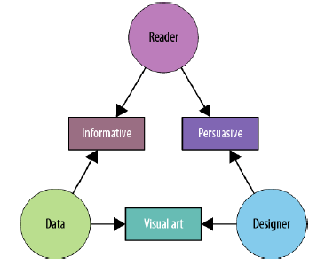
Informative
“An informative visualization primarily serves the relationship between the reader and the data. It aims for a neutral presentation of the facts in such a way that will educate the reader (though not necessarily persuade him). Informative visualizations are often associated with broad data sets, and seek to distill the content into a manageably consumable form. Ideally, they form the bulk of visualizations that the average person encounters on a day-to-day basis — whether that’s at work, in the newspaper, or on a service-provider’s website. The Burning Man Infographic (Figure 1-2) is an example of informative visualization.
Persuasive
“A persuasive visualization primarily serves the relationship between the designer and the reader. It is useful when the designer wishes to change the reader’s mind about something. It represents a very specific point of view, and advocates a change of opinion or action on the part of the reader. In this category of visualization, the data represented is specifically chosen for the purpose of supporting the designer’s point of view, and is presented carefully so as to convince the reader of same. See also: propaganda.
Visual Art
“The third category, visual art, primarily serves the relationship between the designer and the data. Visual art is unlike the previous two categories in that it often entails unidirectional encoding of information, meaning that the reader may not be able to decode the visual presentation to understand the underlying information.
“Whereas both informative and persuasive visualizations are meant to be easily decodable — bidirectional in their encoding — visual art merely translates the data into a visual form. The designer may intend only to condense it, translate it into a new medium, or make it beautiful; she may not intend for the reader to be able to extract anything from it other than enjoyment.”
Designing Data Visualizations . O’Reilly Media.
Creating a Personal Patterns
In the last year I was at Attenex, I carved out research time with Eric Robinson to work on a consumer and personal version of Attenex Patterns. We knew we had to design for a different user than the eDiscovery lawyer that Attenex Patterns targeted. These were some of the attributes we had to prioritize:
-
- A user of personal Patterns would be a casual user. They were likely to use the tool only a couple of times per day.
- The information analyzed would be the user’s personal information. This information would come from Microsoft Office 365 documents and emails. It was outside the scope to try and replace Google or paywall sources of information like Lexis Nexis.
- The initial interface had to look and feel more normal. It needed to be more intuitive.
- The results had to show up as fast as a keyword search list of results.
- The results had to provide obvious value beyond a Google like interface.
As we looked at the existing Attenex Patterns, we focused on reducing the complexity of the interface and figuring out ways to get instantaneous results. We did not want to have to rewrite the “data and document wrangling” tool so we took as a design constraint working with existing personal keyword indexing and searching tools like X1 or dtSearch. I described our early user research in “Transactive Content” and “Whiteboarding: Designing a Software Team.”
One of the lessons I learned at the Institute of Design in Chicago is that observing people in the wild (their actual work or living environment) is far better than trying to interview them. People make stuff up (mostly because they don’t want to appear stupid) when you interview them and most of the time they don’t really understand what they actually do (tacit knowledge). However, they are incredibly “articulate” when you can just observe them in their natural work habitat.
Marty Smith was working on his third draft of a licensing contract for a very large software company headquartered in our area. There was a lot of client discussion around a patent indemnity clause. He knew that he’d had to rework that clause for a couple of different clients in his previous ten years, but he couldn’t remember which clients nor which parties the contracts were for.
Marty’s primary tools are Microsoft Word and Outlook/Exchange. He organizes his file foldering systems (both on the hard drive and in Outlook Exchange) by client and then by year and then by the company name of who a contract was with. One giant hierarchical mess. He could have used a primitive Boolean search engine (but his law firm IT group wouldn’t allow such a thing – corporate security and all). Even if he’d had a search capability, by searching for “patent indemnity” he would have gotten 1000s of hits.
So I watched for thirty minutes as he walked the folder hierarchy, trying to use the client folder names and the contracting party names to jog his memory for one of the three or four contracts he’d modified in the past. He’d drill down through folder after folder; select a contract; scan through the contract in MS Word to see if there even was a patent indemnity clause; find nothing; and then go back to the folder hierarchy. No joy. So after thirty minutes, he gave up and went back to crafting a new clause.
I knew I was seeing something important here, but didn’t know quite what. So I asked a few business model questions.
Skip: How many times a week does this happen to you where you can’t find a clause you are looking for?
Marty: 3-4 times a week.
Skip: How many times a week does it happen to the other 20 IP attorneys in the firm?
Marty: Probably the same amount for each of us. And we never find what we are looking for so we have to draft from scratch. We try for a while, but never find anything.
My back of the envelope business calculation was the extra cost to clients of $500 per hour * 20 attorneys * 2 hours (search plus redrafting time) * 3 times per week = $60,000 per year. In this one law firm we had $60,000 per year of savings for what I was thinking we might price at $20 per seat. Oops, missed the value equation on this one.
I bounced down the stairs to share my findings with Eric. I described what I’d seen (unfortunately because Marty was doing client legal work I couldn’t use video ethnography to record and analyze his interactions). We realized that Gregory Bateson’s difference that would make a difference was if Marty could do clause level searching rather than try and guess at a couple of keywords that might be needed.
We put some straw designs together on the whiteboard and then I left Eric to do a prototype. After a few iterations, Eric worked his brilliance and came up with the following:

Attenuated Search
On the bottom left, the user selects a range of text to use as the search string. The selected text could be a couple of sentences, a paragraph or pages of text. The text is then copied into the search box (top of slide) and the text is treated as if it were a series of “OR” statements. Some 2381 documents were returned. That is clearly too many to look at. So either the slider bar for “Contains” is moved to the right or the “Proximity slider bar” is moved to the right until a more limited number of documents is identified (in the example 42 documents are returned). [NOTE: For those of you interested in the gory details of the search technique you can look at the Attenuated Search patent application.]
Once you get to a reasonable number of documents to look at you can display them with one of the standard visual analytics view of Attenex patterns (semantic network view, social network view, or timeline view).

Personal Patterns Document Mapper
Well, the fun was just starting. I went into my hustler persona and took the opportunity while we were interviewing the CIO at Bell South for a board position to demo the new prototype. I was unprepared for the result. He grabbed my laptop out of my hand and said “I’ll take it back with me.” Momentarily defaulting to my designer role, I objected “But you can’t; it’s just a prototype.” A tug of war with my poor laptop ensued as we both chuckled.
Quickly going back to my hustler persona to see if I could glean some more marketing data, I asked the CIO how much he’d pay if the prototype were indeed a product. He thought for a few seconds and said “I’d want this for the top 100 executives and managers (and our assistants) at Bell South, so I think an enterprise license of $300,000 per year would be appropriate.”
With just the addition of the “clause level” searching, we’d gone from no interest to a “got to have” application that senior managers were willing to pay quite a bit for.
The differences with this prototype versus our first set of prototypes were:
- The ability to search on an arbitrary blob of text, in this case a whole contract clause.
- The user didn’t have to guess what keyword might bring back what they were looking for.
- The ability to interactively select how many results to look at instead of seeing the first 25 of millions of results like with Google. The slider bar interface was intuitive and got to a manageable number of results interactively.
- The ability to map in context visually how the selected results related to each other.
Users didn’t have to understand the complexity of a full visual analytics engine right at the start. They could ease their way into it. Most importantly they could immediately see how much time they would save searching during the course of a work day.
We had a good solution and we had a good feel for the potential market and revenue. Unfortunately, Attenex was sold to FTI Consulting a few months later and Personal Patterns never saw the light of day.
If you are interested in learning more about the development of a visual analytics product like Attenex Patterns, the following documents are downloadable:

Given the fact that Attenex provided the legal profession with proof of concept – multiple order of magnitude gains in efficiency in the discovery space – of the real-world benefits of visualization, the absence of visual apps has been a great mystery. The clarity is appreciated as usual.