
Day 287 of Self Quarantine Covid 19 Deaths in U.S.: 326,000 GA Vote!!
While collaborating with a colleague this week who is pivoting his product to support teams of corporate analysts, he asked me if I could give him a demo of Attenex Patterns that I keep telling him about. Again, I face the reality that telling almost never works. He needs to be shown.
The good news is that he connected his user research with his target audience’s need for a better searching tool to our discussions in the past about Personal Patterns. I’d shown him some screen shots, but screen shots capture just a tiny portion of a dynamic product. I needed to Show him, not tell him.
The first challenge was to find an Attenex Patterns demo video. I knew there were plenty of Ringtail Mapper demos, but I wasn’t sure I had preserved any Attenex Patterns demos. The next challenge is that I have never defined Personal Patterns in a meaningful way. I’ve described the attenuated search prototype that Eric Robinson built, but I was pretty sure I never captured a demo of it. A couple of weeks ago I found an old lap top that had a running version of Attenex Patterns, but I don’t remember how to do a demo from 15 years ago. But I did find an old shockwave video that I was able to convert to an MP4.
The video has all the pieces of Attenex Patterns. Personal Patterns has the same functionality, but starts at a different point which is the typical Boolean search box (to make it familiar for Google users). It is the results presentation that we change to the visualization. I don’t think I have a video of attenuated search, but I have a slide image walk through.

To provide further detail of how Attenex Patterns was integrated into a full eDiscovery suite, these videos of Ringtail SHOW you what the software does. The first video is an overview of FTI Ringtail (now Nuix Discover). About 5:30 minutes in you see the mapper, social net and timeline views. You may need to look at the whole 10 minutes to see how Document Mapper fits into the full Ringtail product. A longer version of the Ringtail demo is available for those who want to learn more. Document Mapper shows up about 28 minutes into this video.
The first part of both of these demos emphasizes linear review. We built Attenex Patterns to eliminate linear review.
These two videos show you the full version of Patterns which I realize I need for detailed research. But for casual users the easy to use Personal Patterns is what I want. A lot of what is needed to build a Personal Patters is now in open source python projects that illustrate natural language processing and interactive visualization of unstructured data. I suspect we can even build it as a “compute cell” in a Jupyter notebook. A former colleague, John Conwell, showed me how to do a prototype with opensource libraries operating on unstructured data. In addition to the semantic network visualizations of Document Mapper, we also used the meta data in email messages to create social network and event network visualizations. To see more of the Ringtail analytics like social network and financial transaction networks here is a video I did for a conference in 2017:
The video is 13:30 minutes long with the financial network analytics starting about 8 minutes in. If you want to read rather than be shown the demo, here is a text description of the Ringtail Network Analytics.
A key to my vision for Personal Patterns is the ability to create and display several network visualizations. To start, compare and contrast visual analytics to the common tools like any Boolean search whether on the net or on your personal data. A Google search for “ringtail mapper demo” returns:

Note that the results list is linear but has Google’s patented “relevancy first” kind of results list. The results list presents relatively few variables:
- Web page name
- File type
- Some summary text
- Ratings information if it is available
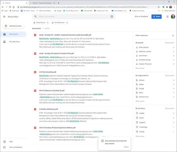
Next we look at Google Pinpoint which just released. It is adding some facets to a search results list which adds a few more variables. These are the results from 209 PDF document I uploaded.

The variables displayed are:
-
- Filename
- People mentioned in the collection of documents and how many documents they are mentioned in
- Organizations and how many documents they are mentioned in
- Locations and how many documents they are mentioned in
When you search for something like OODA, now we have the summary information and the “hit” information from the documents. When I now filter by John Boyd and Attenex I get a little more information:

The idea that we were trying to work with for Attenex Patterns stemmed from the Napolean’s March visual:

This graphic, which I think of as one of the all time best data visualization and sits above my workstation, mapped only 7 variables. I counted up in a display screen with our semantic network visualization, social net, and timeline view, we had over 30 variables displayed. And all the windows and variables had referential integrity. Referential integrity is when you click on a document, or a person, or a time in one of the windows (or any of the other variables), all of the other windows would redisplay in the context of your facet selection. For the most part, users within minutes can navigate the visualizations and do not need a lot of training.
From the video demo file above we have the baseline Patterns visualization:

Instead of getting a relatively undifferentiated list of results from a Boolean search, you see the whole results set AND their relationships to each other at many different levels:
-
- The Green radar circle shows the important concepts and the spines of clusters that have the spine “theme” around the edge that captures the concept for a given spine of documents. Just by looking at these concepts you get a sense of what the WHOLE collection of documents is about.
- On each spine are a set of clusters which contain documents that are related by anywhere from 1 to 20 concepts using a variant of k-means clustering. Spines can intersect at clusters that contain concepts from multiple spines.
- Within a cluster, documents are spiraled. At the center of a spiral is the document that is most on point with the concepts that caused the documents to cluster.
- You can color code documents to represent “themes” that are how you manually want to tag things.
- We then have several windows of facets that point back into the document set and can highlight those facets.
- A longer list of concepts
- The people that are referenced in a document (like the From and To fields of an email)
- The organizations that are referenced (the right side of an “@” in an email header)
- The time that the document was created
- Who sent who an email
- And on and on
Relationships and the volume of information in the WHOLE collection are displayed with a single click and just a easily re-oriented.
That set of relationships in easy to click facets is what is missing in any Boolean search tool. I will keep emphasizing this – the key to Patterns is SEEING THE WHOLE and then being able to click and reorganize as you filter and subset the whole. I assert that you can NEVER do this with a list of results in typical Boolean search engines.
As a reminder, the dirty little secret of Boolean search is that you have to know the answer before you start AND be able to articulate it in one or a very few keywords. The assumption with Patterns is that you rarely know exactly what you are looking for. You particularly don’t know what you are looking for when you are looking at a collection of someone else’s or some other organizations documents. As you add documents to your collection, the clustering of the documents will change. Taxonomies and Ontologies require manual updating all the time to accommodate changing document collections. You want to be able to see the current whole, and then get close as you DISCOVER what you are really looking for.
We built a research prototype that wowed everyone we showed it to. It was Attenuated search. I don’t have a good demo of Attenuated search and I deeply regret not productizing the prototype. You can find a description and some screen shots in the blog post “why are there so few visual analytics:
We realized that results in a Personal Patterns had to be immediate like Google search. We also realized that there could be little to no learning curve. So we hit on the combination of a traditional search engine with some twists. The user sees a relatively large search box with a couple of slider bars. You can copy as little or as much text into the search box (pages of text if you want). Then with the slider bars you dial in how many documents you want to visualize with your desired combination of semantic network, social network and event network (timeline view). With our last prototypes at FTI we also added getting data from your cell phone so that we could visualize your text messages and show geographic network views – where were messages being sent from and to if your phones location data was turned on.
There is some real brilliance to the clusters and spines and radar circle that we didn’t realize until much later. The user interface itself evolved through extensive rapid prototyping (300+ over three years):

Bill Knight, who was CTO for a while at Attenex, has reminded me over the years what we uniquely created. I’ve done a couple of interviews with him to understand what he saw. A couple of years ago he used the techniques we developed to do a very innovative ad placement bid and respond system for digital marketing which combined machine learning and AI expert systems.
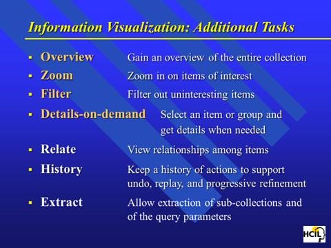
Personal Patterns is all about seeing the relationships and patterns of variables in unstructured information in the WHOLE of a results set. After I left FTI Ringtail, we figured out how to show more than 300,000 documents in a single recursive display – the zooming in and the overview effect. Ben Schneiderman has come as close as anyone to describing guidelines for visual analytics:

This concludes the show portion of this blog post.
Let me switch gears to sharing my needs for a personal patterns as a product researcher, a human centered design researcher, and a business planning researcher.
I’ve been trying to express my needs for Personal Patterns before trying to design it. My developer colleagues keep asking me for a definition of Personal Patterns. They know I have something in my head, but beyond “Attenuated Search” they have little idea how personal patterns is different from the eDiscovery Patterns. I have attempted this multiple times and my current document is >50 pages. I keep trying to get to the essence. But I keep mixing in the feature design for the tool instead of focusing with clarity on my needs. I also keep forgetting to take a video of my actual work where I want to use a personal patterns.
Today, I try something different. I try to focus on my needs rather than trying to describe features. In generating this list, I realize that I still have to shift to Outcomes and Impact. I need to be more coherent about the conversation component of what I need. I need to somehow SHOW the relationship between researcher/author and audience. Here is my current attempt at the short list of needs.
- Relationships: I want to see the WHOLE Of a “document” collection and the relationships between the documents (semantic network, social network, event network, location network).
- The need is primarily because I just can’t remember the specifics of what I am looking for. I need a large map of relationships to jog my memory. I have 10 terabytes of documents (text, audio, video, images) on my desktop from 40 years of using digital document creation tools. I need to think more associatively and have existing documents more quickly remind me of what I vaguely remember.
- For example, I wanted to pull out some user design materials we used in the early days of Attenex. All I could think of was that it had something to do with “zoom” and “overview effect.” But I couldn’t remember who was the academic who provided the key design points. When I searched my own stuff with X1 or academic stuff on Google, all that came back was millions of entries on the company Zoom or meeting request data.
- Then I remembered that it had something to do with Eyes as in Many Eyes. I searched for that and found the MIT folks who were doing research on visualization. But that wasn’t it. I looked at their references and there was a link to Ben Schneiderman.
- That sounded familiar so I looked for articles by Ben. I finally found a link to a paper on the Eyes Have it.
- Then I remembered that Tony Krebs took Schneiderman’s presentation and adapted it for Attenex.
- And that led to the slide I was looking for. I have too many examples like this search process for something I vaguely remember but want to include in what I am currently researching.
-
-
-
-
- My belief is just having an attenuated search for a “zoom” and “overview” search would then display the many clusters of variants I have of this Powerpoint and Schneiderman’s articles.
- Even though I knew what I was looking for, I didn’t know the keywords that would get me there.
-
-
-
- Author: Making sense of the research that I am doing for several projects – the Know Now book (pulling together my writing, a hundred hours of Zoom transcripts, 2000 searchable PDFs of my professional Kindle library, 1000s of web pages that are captured in Evernote, and many long documents of my writing or presentations), my research for personal faceted federated search tool, my research for Personal Patterns (product plan, user research, and business plan), and my research for my strategy consulting for several executives I am coaching.
- Google Pinpoint is a very rudimentary example of a faceted search (but not federated search) that is trying to go after research for journalists. So it is a confirmation to me that even Google is seeing the need for a research type tool like Personal Patterns.
-
- While Pinpoint is a step forward, even a basic Personal Patterns with Attenuated search and simple visualizations is far better.
- The above screen image shows a search from the 209 PDFs I uploaded and has the people, organizations, and locations referenced in those documents (the facets on the right). I’ve subset the documents by filtering for Professor David Socha and Eric Robinson to the six documents that they are both referenced in.
- I have looked at > 10 qualitative research tools and they all suck. So the whole qualitative research opportunity is open for innovation as well. I confirmed this need with several early stage startup CEOs who have struggled to capture and then make sense of their early user research observation and interviews.
- While I am authoring, I want to author and edit so that my research can be found by others. Peter Morville describes this as Ambient Findability.
- Audience: The next part of a research tool is that research needs to be communicated. My problem with most communication tools is that when I receive a static document like a PDF and a list of references, I then have to go chase the references. There is nothing in a static communication that allows me to see the context easily. So publishing my content both as a document as well as a Personal Patterns “briefcase” (like Summation used to do in the old days with briefcasing to pull all of the relevant documents like depositions and trial exhibits into a single “folder” for litigators). Shipping not just the documents but also the selected and curated “networks” of relationships between the documents would be what I want as a reader, not just as an author. The Personal Patterns should have the semantic network, the social network, the event network and the location network (from photos and from digital data dumps from cell phone data – see ESI Analyst).
- Publish: The formal version of an audience is the Publish paradigm. I am ready to now publish and get feedback from either an internal audience (product team, business team, executive team …) or an external audience. I want to do all of the things like with the Audience need above and get reader feedback (the telemetry capability that many software applications provide to the developers). How many people have looked at something, how many people have highlighted or commented on what in the document (kind of like the Kindle stats), what is the sentiment about the published content ….?
- Investigate: In talking with eDiscovery consultants, I was reminded of the Investigate use case. Craig Ball at the Ringtail User Conferences reminded us all that if you could choose between email or getting info from a cell phone always choose the cell phone for investigations. Personal Patterns can do a lot more because we are also looking at desktop and cloud documents, not just cell phone data. Ediscovery vendors share that probably 10% of their business is investigations, primarily from their smaller customers which is why they create low end offerings. Investigate is just a special purpose view of research. The key thing with these research needs is that you don’t know the information like you do with your own email and file folders.
- Keeping Found Things Found (KFTF): The derivative need is to figure out a way to keep things found that I have searched for. So much of my searching is for stuff I have already found and saved – somewhere. My belief is that the semantic network viz will help with this quite a bit. You can find out more about KFTF from William Jones at UW.
So these are my needs. Today I am trying to solve for this with X1 for personal stuff and Google for web stuff. Both are unsatisfactory for my needs.
When I can figure out how to set up multiple cameras I will have user research highlights for the above needs.
I am also working on a formal paper about my lifetime in producing search tools. When we developed ALL-IN-1, one of our first customers was the Reagan White House. Our software was what tripped Ollie North up because “delete” didn’t mean delete. When we would check in periodically with the White House folks, they would talk about the search issues they were having with All-IN-1 in the White House situation room. The needs discussions were about all of the problems with Boolean Search. They would describe the iterative and repetitive and sometimes recursive process they would use ALL-IN-1’s Boolean search for. The repetitive searches were all about trying to vaguely recall something. They would share something like “show me all the message traffic about a terrorist in Israel.” The results would come up on a large monitor and they would go “no, that’s not it.” Maybe it was Egypt. Nope. Ok, let’s try Iran. “OK that looks familiar, now let’s look for a terror cell with a crazy English name.” And so on. The staffers would say that these sessions would often go on for 30 minutes before they would find what they were looking for. They would ask us all the time for a better way. We just had no idea of a solution at the time.
At the start of Attenex when we were trying to use SPIRE from PNNL, the researchers described SPIRE as the answer to almost exactly the kind of discussion above that the folks at NSA and CIA were still asking for. From 1980 (All-IN-1) to 2000 (SPIRE) the problem still was not widely solved. When I talked to John Seeley Brown in 2005 he was a chief scientist for NSA and he said the problem still existed. As I have found the last year, the problem still exists for everyone of us that tries to do research with unstructured data.
The kinds of users I’ve identified for Personal Patterns are (and probably many more):
-
- Product Managers
- Early Stage Startup CEOs
- Folks who write business plans
- Data scientists trying to write up their results
- Academic researchers
- Financial analysts at the big financial firms writing reports for consumers
- Industry analysts like the Gartner Group and Forrester Group
- Legal brief writing for litigation and transactional law
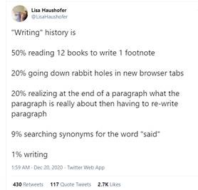
This tweet from an academic researcher kind of says it all:
So there is a market for such a tool as Personal Patterns.
I will keep refining the above into the following plans:
- A product plan (with a needs section)
- A user research plan
- A business plan
Note that all of these activities need the Personal Patterns tool for my research. And my discussion has come full circle. By writing this out, I am ready to create a user research video of what I need for Personal Patterns. I am ready to SHOW the need, not just TELL.
A former lawyer colleague who was an Attenex customer many moons ago suggested a way to get some publicity for Personal Patterns if it actually existed. His timely thought for the day:
If I had a Personal Patterns 1.0: I’d create an interactive version of the 6000-page spending bill that Senators received this week and are expected to vote on.
1.1 then use that to crowdsource review and public opinion on its provisions
1.2 then automatically table any major sections that have 90 or 95% disapproval
The suggestion is an interesting use case for a social media variant of Personal Patterns. I will save that for the V2.0 discussion. I need the 1.0 right now.
Observe, Don’t Ask. Show, Don’t Tell. Prototype, Don’t Guess. Act, Don’t Delay.