
Day 293 of Self Quarantine Covid 19 Deaths in U.S.: 339,000 GA Vote!!

Day 293 of Self Quarantine Covid 19 Deaths in U.S.: 339,000 GA Vote!!
Day 292 of Self Quarantine Covid 19 Deaths in U.S.: 335,000 GA Vote!!

One of many hidden gems on Bainbridge Island – the Halls Hill Labyrinth.
Essays on this labyrinth from its designer and builder, Jeffrey Bale.
Day 291 of Self Quarantine Covid 19 Deaths in U.S.: 333,000 GA Vote!!
I am in the process of writing my second book – Know Now. I had planned for this to be a traditional book aimed at early stage entrepreneurs and product managers in startups and large companies. As I was getting ready to write, Rowan Cockett of iooxa introduced me to the work he is doing to put a more friendly user interface on top of Jupyter Notebooks.
“What is a Jupyter notebook?” I asked. He shared that it is what research and data scientists are using to intertwingle narrative and computing. I realized that this kind of platform was what I’ve been looking for, but thought I was going to have to use a combination of text and then some auxiliary spreadsheets. Yet, the more that I dug into Jupyter notebooks I realized how much computing and use of a dogs breakfast of spread sheets that a startup CEO and a product manager are always creating. The spread sheets are mostly for themselves to keep track of the 100s of things that need a little bit of data and arithmetic. A Juptyer notebook is a great way to combine both.
The challenge though is there aren’t that many of us that are comfortable programming or know the Python language that is used in Jupyter notebooks. I could always cajole one of my software engineering colleagues into helping me out or I could reteach myself how to program.
About this time, GPT-3 was announced. I followed OpenAI and their previous announcements, but not very closely. The GPT-3 announcement was stunning to me for one big reason – the initial demos showed that GPT-3 could also do some programming. The early examples showed the user typing a few English language sentences and then GPT-3 would generate the program. The “no code” movement just took a huge leap forward. KDnuggets shared a diagram of the growth in parameters that OpenAI used to go from GPT-2 to GPT-3.

Sharif Shameem showed an early demo of the “no code” in his tool debuild.co which builds a functioning React app by describing what he wants to do in English.

By typing in the English of what he wants:
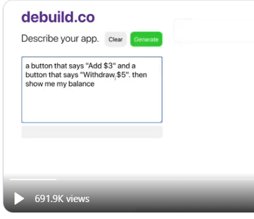
You can see that GPT-3 adds the two buttons and then executes the buttons.
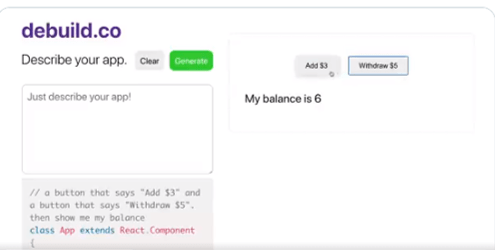
The program that GPT-3 generates is below the text box that the user enters their English language description of the program.
After this jaw dropper of a capability, I searched for every example I could find from the developers who got early access to the GPT-3 beta.
Then, Microsoft announced their first product that arose from Project Cortex – Sharepoint Syntex. The Syntex demo illustrates how a normal Microsoft 365 user could create a sophisticated document recognition system and extract key features from the document with just a couple of example documents. The demo replicated what we spent $15 million to try and do at Conga just a year earlier. Now the contract recognition and field extraction could be done by a normal user in just a few minutes for the price of an Office 365 license.
I reached out to my colleague John Conwell, a data scientist at Domain Tools, to see how he used Jupyter notebooks. He showed me how easy it is to do the coding, generate tables of results or output the results in to a data file. Then he showed me how he does natural language processing and then cluster mapping of the themes in his unstructured text. He demoed how Jupyter, Python and all the many open source libraries could almost replicate what we did in Attenex Patterns.
As I thought more about the Know Now book I am drafting, I realized that I would have a lot of text. Some of the text would be mine, some of the text would be from searchable PDFs of the 2500 books I want to reference, and some would be from the 1000s of web pages I’ve curated and captured within Evernote. I envisioned a search engine being needed to navigate the Know Now book as it was unlikely to ever be read linearly. I needed a Personal Patterns inside of my Know Now book.
As I absorbed the implications of what I wanted to write, the audience I am writing for, and the new technologies like Jupyter, GPT-3, and Project Cortex, I thought that GPT-3 could “write” both the narrative and the code for a given topic. All I had to do was to generate a couple lines of English or point to some source text and GPT-3 could generate both the narrative and the computing cells to accomplish the task.
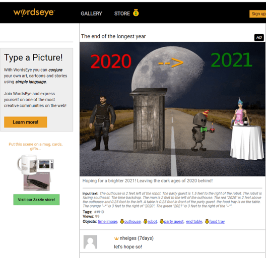
For years I’ve followed the WordsEye tool where you can “type a picture.”
The input text that generates this image is:
“The outhouse is 2 feet left of the robot. The party guest is 1.5 feet to the right of the robot. The robot is facing southeast. The time backdrop. The man is 2 feet to the left of the outhouse. The red “2020” is 2 feet above the outhouse and 0.25 foot to the left. A table is 0.25 foot in front of the party guest. the food tray is on the table. The orange “–*” is 3 feet to the right of “2020”. The green “2021” is 3 feet to the right of the “–*”.”
I remembered a demo in the past from Marklogic (an XML database company) who partnered with Reed Elsevier (now RELX Group) to generate custom documents on the fly from the large database of text books that Elsevier had in XML format (see case study on Unlocking the Value of Content at Elsevier). In the medical example, you would ask a question within a MarkLogic application and it would go retrieve that information from the text books and then generate a 3-5 page great looking pamphlet on the topic – either online or in print. Since Elsevier had put all of the formatting along with the XML in their text book the output of a query looked like it had retrieved a “published” result. Yet, the answer and the output occurred in real time. Elsevier found another revenue stream for the high cost content that went into their textbooks.
With GPT-3, maybe I can do the same thing AND generate the coding cells to go along with the narrative. As an example of a blog post that contains both narrative and some rudimentary formulas, Paul Graham talked about a formula in The Equity Equation for how to allocate stock to the first 10-20 employees of a startup.
“An investor wants to give you money for a certain percentage of your startup. Should you take it? You’re about to hire your first employee. How much stock should you give him?
These are some of the hardest questions founders face. And yet both have the same answer:
1/(1 – n)
Whenever you’re trading stock in your company for anything, whether it’s money or an employee or a deal with another company, the test for whether to do it is the same. You should give up n% of your company if what you trade it for improves your average outcome enough that the (100 – n)% you have left is worth more than the whole company was before.
For example, if an investor wants to buy half your company, how much does that investment have to improve your average outcome for you to break even? Obviously it has to double: if you trade half your company for something that more than doubles the company’s average outcome, you’re net ahead. You have half as big a share of something worth more than twice as much.
In the general case, if n is the fraction of the company you’re giving up, the deal is a good one if it makes the company worth more than 1/(1 – n).”
As you start to work out the arithmetic, it becomes pretty clear that you need a spread sheet or maybe even a program. As you look at the article some more, you realize that Graham is really describing a planning tool and a simulation tool where you want to think through what kinds of employees you need and how much value each will bring to the new entity. This tool needs to be cumulative so that you have the plans from previous hires as the starting point for the next hire.
To test out what the compute cells might look like to accompany the article, I had an intern use Google Colab (a Jupyter notebook alternative) to test these ideas out. In the narrative cells, we placed Graham’s article. In the compute cells, we used his formula as a starting point, but quickly realized we needed to generate our own formulas to guestimate some of the variables that Graham describes like the pre-money valuation of your startup.

Letting my imagination run wild, I wonder if I can “connect” the Know Now book to the reader’s email and then suggest that they check the explanatory information in the book to help them think through an upcoming action. With the above example in mind, Know Now could figure out that the CEO is using job boards to post an opening in their startup or asking former colleagues for recommendations for a particular set of job skills. Or I might see that the CEO is setting up some interviews with prospective hires. I could send an alert through email or Slack or Microsoft Teams to say “It looks like you are getting ready to hire somebody. Have your thought about the compensation package you are going to offer? If not, you might want to check out Paul Graham’s article and then the compensation simulation tool that goes with it.”
With Graham’s article as a starting point, GPT-3 could then customize the article in the context of the current CEO, their company, the nature of their business, and then start filling in some of the variables in the compute cells of the Jupyter notebook.
The task of authoring the Know Now book becomes more of a curation process rather than a complete authoring process. The curation process combines the following:
What I like about these ideas and the capabilities of GPT-3, Jupyter notebooks, and Project Cortex is that they can be easily connected through a platform like Microsoft 365 where I spend most of my day. As an author, I like the ability to mass personalize the content that I am creating and that a wealth of others have created to the day to day work of an early stage startup CEO.
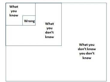
So much of the work of a new CEO in a new startup is figuring out what you don’t know you don’t know (see the Four Boxes of Knowing) and then being able to quickly learn what you need Just In Time. So much of entreprenuerial literature is Just in Case learning rather than Just in Time. The combination of these new technologies and appropriate personalized content promises an exciting shift to Just In Time learning while you are doing the work of your startup business.
If you want to learn a bit more with a curated demo of several of GPT-3’s test applications, this video provides a wide ranging overview of what is possible.
Day 291 of Self Quarantine Covid 19 Deaths in U.S.: 333,000 GA Vote!!

Day 290 of Self Quarantine Covid 19 Deaths in U.S.: 332,000 GA Vote!!

Day 289 of Self Quarantine Covid 19 Deaths in U.S.: 330,000 GA Vote!!

Day 288 of Self Quarantine Covid 19 Deaths in U.S.: 329,000 GA Vote!!
I am a sucker for interesting visualizations. A Chirpty twitter social network view showed up in my Twitter feed. I couldn’t resist. I had to generate my very own.
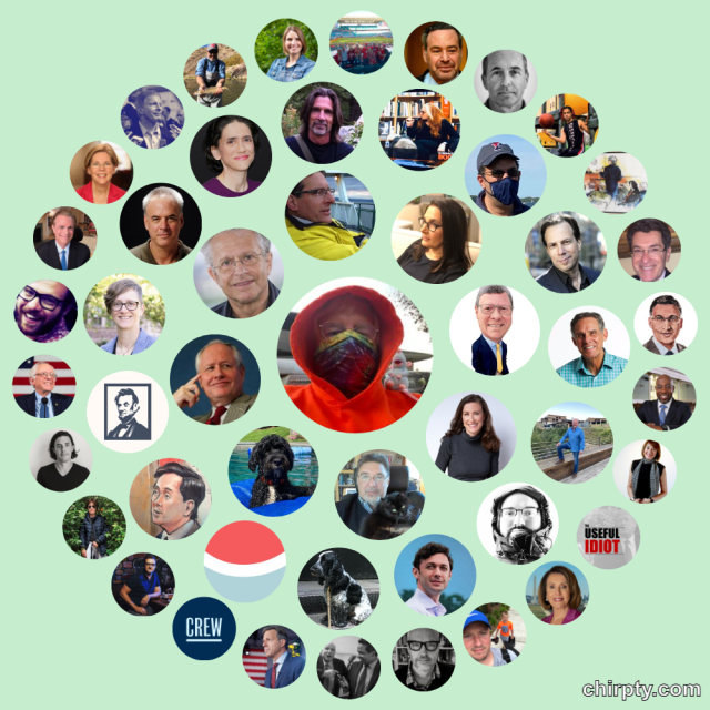
Yes, all of the faces or symbols are folks I follow. In fairness, I never really used Twitter until about four months ago when I started doom scrolling each day for an hour or two. Most of the images are of pundits or thoughtful folks I like and retweet quite a bit. Chirpty even reinforces my doom scrolling habits by providing what I jokingly call my “Three circles of hell.”

In the wonderful gifting of the Internet hackers, there is a blog post on how to develop your own Chirpty.
It is interesting to see Chirpty show up at the same time I was writing about the Social Networking visual analytics we built over the last decade.
In addition to the semantic network visualizations of Document Mapper, we also used the meta data in email messages to create social network and event network visualizations. To see more of the Ringtail analytics like social network and financial transaction networks here is a video I did for a conference in 2017:
The video is 13:30 minutes long with the financial network analytics starting about 8 minutes in. If you want to read rather than be shown the demo, here is a text description of the Ringtail Network Analytics.
A couple of grad students at MIT developed a surprisingly useful social networking demo called Immersion. The pleasant surprise was how quick it generated the social graph from the hundreds of thousands of my Gmails.
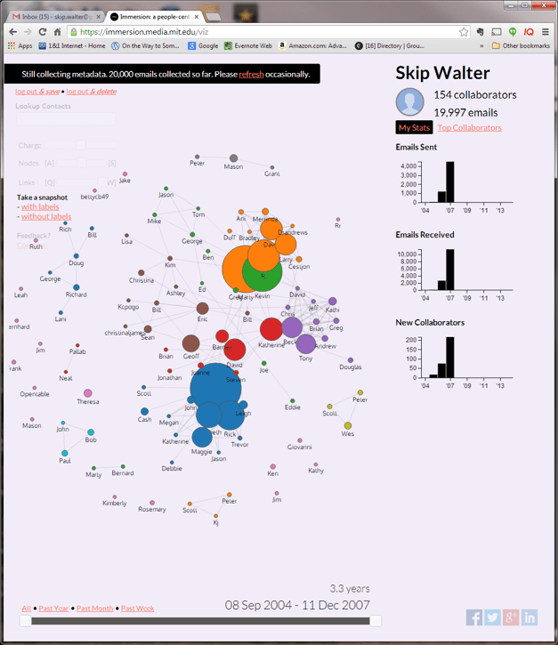
You could look at who you communicated with and the amount of communication at any point in time.
You could also click on one of the people and see who else you communicated with when you emailed that person.
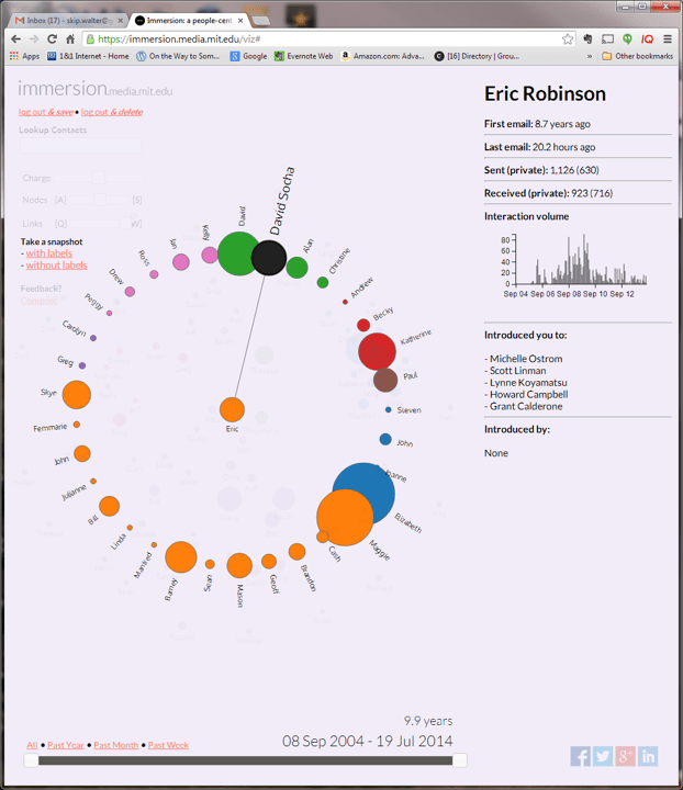
A really nice feature on the right pane is who that person introduced you to through email.
Ronald Burt through articles and books introduced me to the field of social network analysis. Burt’s descriptions of structural holes in social networks was especially helpful for using social network analysis to improve organizational functioning.
With a little searching you can find several articles on social network analysis and tools for social networking visualizations:
Most of these tools use “dots” to represent people. It is such a joy to see tools like Chirpty and MentionMapp show the people in my life.

Wishing you all and your social network a joyous holiday.
Day 288 of Self Quarantine Covid 19 Deaths in U.S.: 329,000 GA Vote!!

Day 287 of Self Quarantine Covid 19 Deaths in U.S.: 326,000 GA Vote!!
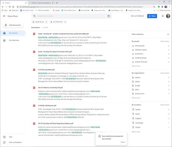
While collaborating with a colleague this week who is pivoting his product to support teams of corporate analysts, he asked me if I could give him a demo of Attenex Patterns that I keep telling him about. Again, I face the reality that telling almost never works. He needs to be shown.
The good news is that he connected his user research with his target audience’s need for a better searching tool to our discussions in the past about Personal Patterns. I’d shown him some screen shots, but screen shots capture just a tiny portion of a dynamic product. I needed to Show him, not tell him.
The first challenge was to find an Attenex Patterns demo video. I knew there were plenty of Ringtail Mapper demos, but I wasn’t sure I had preserved any Attenex Patterns demos. The next challenge is that I have never defined Personal Patterns in a meaningful way. I’ve described the attenuated search prototype that Eric Robinson built, but I was pretty sure I never captured a demo of it. A couple of weeks ago I found an old lap top that had a running version of Attenex Patterns, but I don’t remember how to do a demo from 15 years ago. But I did find an old shockwave video that I was able to convert to an MP4.
The video has all the pieces of Attenex Patterns. Personal Patterns has the same functionality, but starts at a different point which is the typical Boolean search box (to make it familiar for Google users). It is the results presentation that we change to the visualization. I don’t think I have a video of attenuated search, but I have a slide image walk through.

To provide further detail of how Attenex Patterns was integrated into a full eDiscovery suite, these videos of Ringtail SHOW you what the software does. The first video is an overview of FTI Ringtail (now Nuix Discover). About 5:30 minutes in you see the mapper, social net and timeline views. You may need to look at the whole 10 minutes to see how Document Mapper fits into the full Ringtail product. A longer version of the Ringtail demo is available for those who want to learn more. Document Mapper shows up about 28 minutes into this video.
The first part of both of these demos emphasizes linear review. We built Attenex Patterns to eliminate linear review.
These two videos show you the full version of Patterns which I realize I need for detailed research. But for casual users the easy to use Personal Patterns is what I want. A lot of what is needed to build a Personal Patters is now in open source python projects that illustrate natural language processing and interactive visualization of unstructured data. I suspect we can even build it as a “compute cell” in a Jupyter notebook. A former colleague, John Conwell, showed me how to do a prototype with opensource libraries operating on unstructured data. In addition to the semantic network visualizations of Document Mapper, we also used the meta data in email messages to create social network and event network visualizations. To see more of the Ringtail analytics like social network and financial transaction networks here is a video I did for a conference in 2017:
The video is 13:30 minutes long with the financial network analytics starting about 8 minutes in. If you want to read rather than be shown the demo, here is a text description of the Ringtail Network Analytics.
A key to my vision for Personal Patterns is the ability to create and display several network visualizations. To start, compare and contrast visual analytics to the common tools like any Boolean search whether on the net or on your personal data. A Google search for “ringtail mapper demo” returns:

Note that the results list is linear but has Google’s patented “relevancy first” kind of results list. The results list presents relatively few variables:
Next we look at Google Pinpoint which just released. It is adding some facets to a search results list which adds a few more variables. These are the results from 209 PDF document I uploaded.

The variables displayed are:
When you search for something like OODA, now we have the summary information and the “hit” information from the documents. When I now filter by John Boyd and Attenex I get a little more information:

The idea that we were trying to work with for Attenex Patterns stemmed from the Napolean’s March visual:

This graphic, which I think of as one of the all time best data visualization and sits above my workstation, mapped only 7 variables. I counted up in a display screen with our semantic network visualization, social net, and timeline view, we had over 30 variables displayed. And all the windows and variables had referential integrity. Referential integrity is when you click on a document, or a person, or a time in one of the windows (or any of the other variables), all of the other windows would redisplay in the context of your facet selection. For the most part, users within minutes can navigate the visualizations and do not need a lot of training.
From the video demo file above we have the baseline Patterns visualization:

Instead of getting a relatively undifferentiated list of results from a Boolean search, you see the whole results set AND their relationships to each other at many different levels:
Relationships and the volume of information in the WHOLE collection are displayed with a single click and just a easily re-oriented.
That set of relationships in easy to click facets is what is missing in any Boolean search tool. I will keep emphasizing this – the key to Patterns is SEEING THE WHOLE and then being able to click and reorganize as you filter and subset the whole. I assert that you can NEVER do this with a list of results in typical Boolean search engines.
As a reminder, the dirty little secret of Boolean search is that you have to know the answer before you start AND be able to articulate it in one or a very few keywords. The assumption with Patterns is that you rarely know exactly what you are looking for. You particularly don’t know what you are looking for when you are looking at a collection of someone else’s or some other organizations documents. As you add documents to your collection, the clustering of the documents will change. Taxonomies and Ontologies require manual updating all the time to accommodate changing document collections. You want to be able to see the current whole, and then get close as you DISCOVER what you are really looking for.
We built a research prototype that wowed everyone we showed it to. It was Attenuated search. I don’t have a good demo of Attenuated search and I deeply regret not productizing the prototype. You can find a description and some screen shots in the blog post “why are there so few visual analytics:
We realized that results in a Personal Patterns had to be immediate like Google search. We also realized that there could be little to no learning curve. So we hit on the combination of a traditional search engine with some twists. The user sees a relatively large search box with a couple of slider bars. You can copy as little or as much text into the search box (pages of text if you want). Then with the slider bars you dial in how many documents you want to visualize with your desired combination of semantic network, social network and event network (timeline view). With our last prototypes at FTI we also added getting data from your cell phone so that we could visualize your text messages and show geographic network views – where were messages being sent from and to if your phones location data was turned on.
There is some real brilliance to the clusters and spines and radar circle that we didn’t realize until much later. The user interface itself evolved through extensive rapid prototyping (300+ over three years):

Bill Knight, who was CTO for a while at Attenex, has reminded me over the years what we uniquely created. I’ve done a couple of interviews with him to understand what he saw. A couple of years ago he used the techniques we developed to do a very innovative ad placement bid and respond system for digital marketing which combined machine learning and AI expert systems.
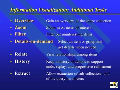
Personal Patterns is all about seeing the relationships and patterns of variables in unstructured information in the WHOLE of a results set. After I left FTI Ringtail, we figured out how to show more than 300,000 documents in a single recursive display – the zooming in and the overview effect. Ben Schneiderman has come as close as anyone to describing guidelines for visual analytics:

This concludes the show portion of this blog post.
Let me switch gears to sharing my needs for a personal patterns as a product researcher, a human centered design researcher, and a business planning researcher.
I’ve been trying to express my needs for Personal Patterns before trying to design it. My developer colleagues keep asking me for a definition of Personal Patterns. They know I have something in my head, but beyond “Attenuated Search” they have little idea how personal patterns is different from the eDiscovery Patterns. I have attempted this multiple times and my current document is >50 pages. I keep trying to get to the essence. But I keep mixing in the feature design for the tool instead of focusing with clarity on my needs. I also keep forgetting to take a video of my actual work where I want to use a personal patterns.
Today, I try something different. I try to focus on my needs rather than trying to describe features. In generating this list, I realize that I still have to shift to Outcomes and Impact. I need to be more coherent about the conversation component of what I need. I need to somehow SHOW the relationship between researcher/author and audience. Here is my current attempt at the short list of needs.
So these are my needs. Today I am trying to solve for this with X1 for personal stuff and Google for web stuff. Both are unsatisfactory for my needs.
When I can figure out how to set up multiple cameras I will have user research highlights for the above needs.
I am also working on a formal paper about my lifetime in producing search tools. When we developed ALL-IN-1, one of our first customers was the Reagan White House. Our software was what tripped Ollie North up because “delete” didn’t mean delete. When we would check in periodically with the White House folks, they would talk about the search issues they were having with All-IN-1 in the White House situation room. The needs discussions were about all of the problems with Boolean Search. They would describe the iterative and repetitive and sometimes recursive process they would use ALL-IN-1’s Boolean search for. The repetitive searches were all about trying to vaguely recall something. They would share something like “show me all the message traffic about a terrorist in Israel.” The results would come up on a large monitor and they would go “no, that’s not it.” Maybe it was Egypt. Nope. Ok, let’s try Iran. “OK that looks familiar, now let’s look for a terror cell with a crazy English name.” And so on. The staffers would say that these sessions would often go on for 30 minutes before they would find what they were looking for. They would ask us all the time for a better way. We just had no idea of a solution at the time.
At the start of Attenex when we were trying to use SPIRE from PNNL, the researchers described SPIRE as the answer to almost exactly the kind of discussion above that the folks at NSA and CIA were still asking for. From 1980 (All-IN-1) to 2000 (SPIRE) the problem still was not widely solved. When I talked to John Seeley Brown in 2005 he was a chief scientist for NSA and he said the problem still existed. As I have found the last year, the problem still exists for everyone of us that tries to do research with unstructured data.
The kinds of users I’ve identified for Personal Patterns are (and probably many more):
This tweet from an academic researcher kind of says it all:
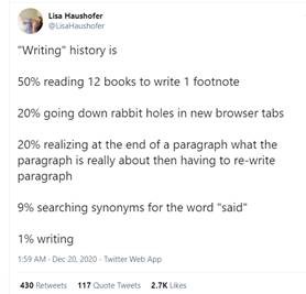
So there is a market for such a tool as Personal Patterns.
I will keep refining the above into the following plans:
Note that all of these activities need the Personal Patterns tool for my research. And my discussion has come full circle. By writing this out, I am ready to create a user research video of what I need for Personal Patterns. I am ready to SHOW the need, not just TELL.
A former lawyer colleague who was an Attenex customer many moons ago suggested a way to get some publicity for Personal Patterns if it actually existed. His timely thought for the day:
If I had a Personal Patterns 1.0: I’d create an interactive version of the 6000-page spending bill that Senators received this week and are expected to vote on.
1.1 then use that to crowdsource review and public opinion on its provisions
1.2 then automatically table any major sections that have 90 or 95% disapproval
The suggestion is an interesting use case for a social media variant of Personal Patterns. I will save that for the V2.0 discussion. I need the 1.0 right now.
Observe, Don’t Ask. Show, Don’t Tell. Prototype, Don’t Guess. Act, Don’t Delay.
Day 287 of Self Quarantine Covid 19 Deaths in U.S.: 326,000 GA Vote!!
For the last 50 years, my personal holiday tradition is waiting until the last minute to go shopping for Christmas gifts. I love the energy of being with lots of procrastinators. They are my peeps. I miss them.
Shopping on Amazon just isn’t the same.

